Faster and leaner than a traditional shoot, with imagery built to work across every channel.
Campaign, product page, lifestyle, story frames, banners and email — a dozen surfaces minimum, and they all need to feel like one brand rather than a folder of unrelated files. Traditionally that's a shoot, a crew and a retoucher. I build the visual system once and carry it across every placement, working from your product photography and approved artwork to keep the product recognisable, consistent and on-brand throughout.
An eye shaped by 10 years of building production-ready assets for VFX and animation — form, materials, proportion and continuity.
Case 01
NOIR RUE —
Fashion Campaign System
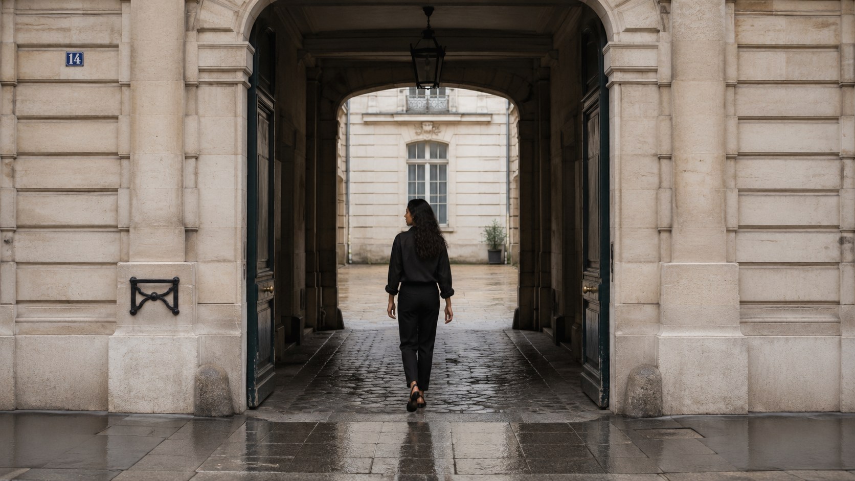
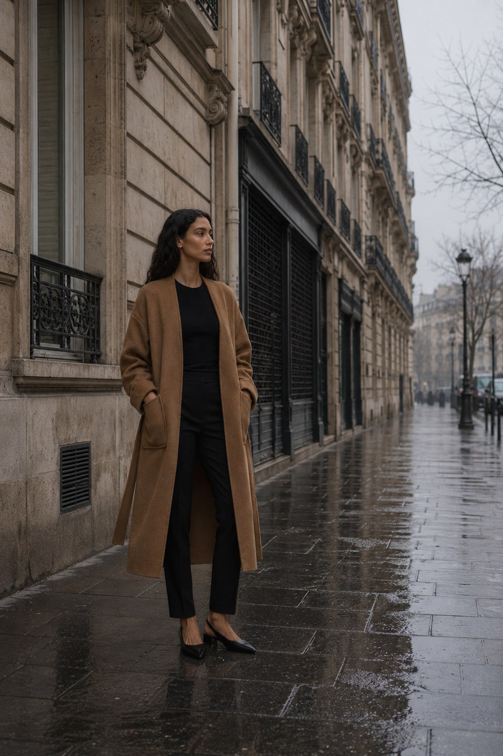
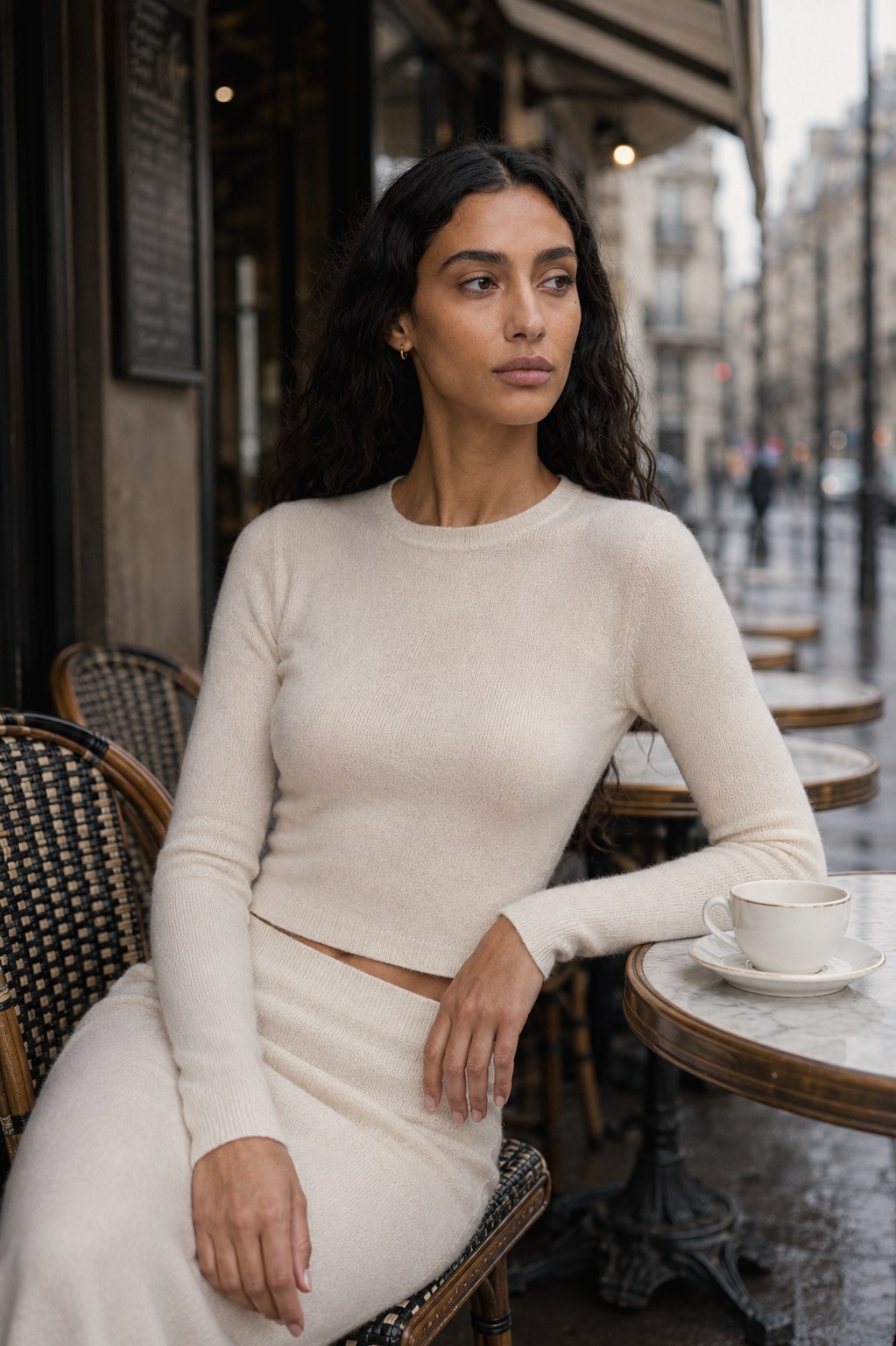
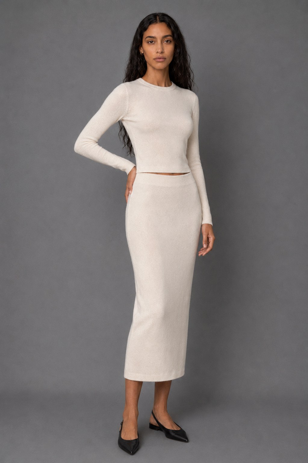
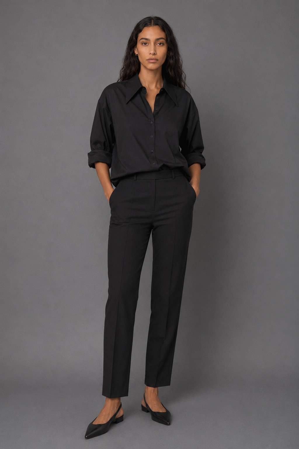
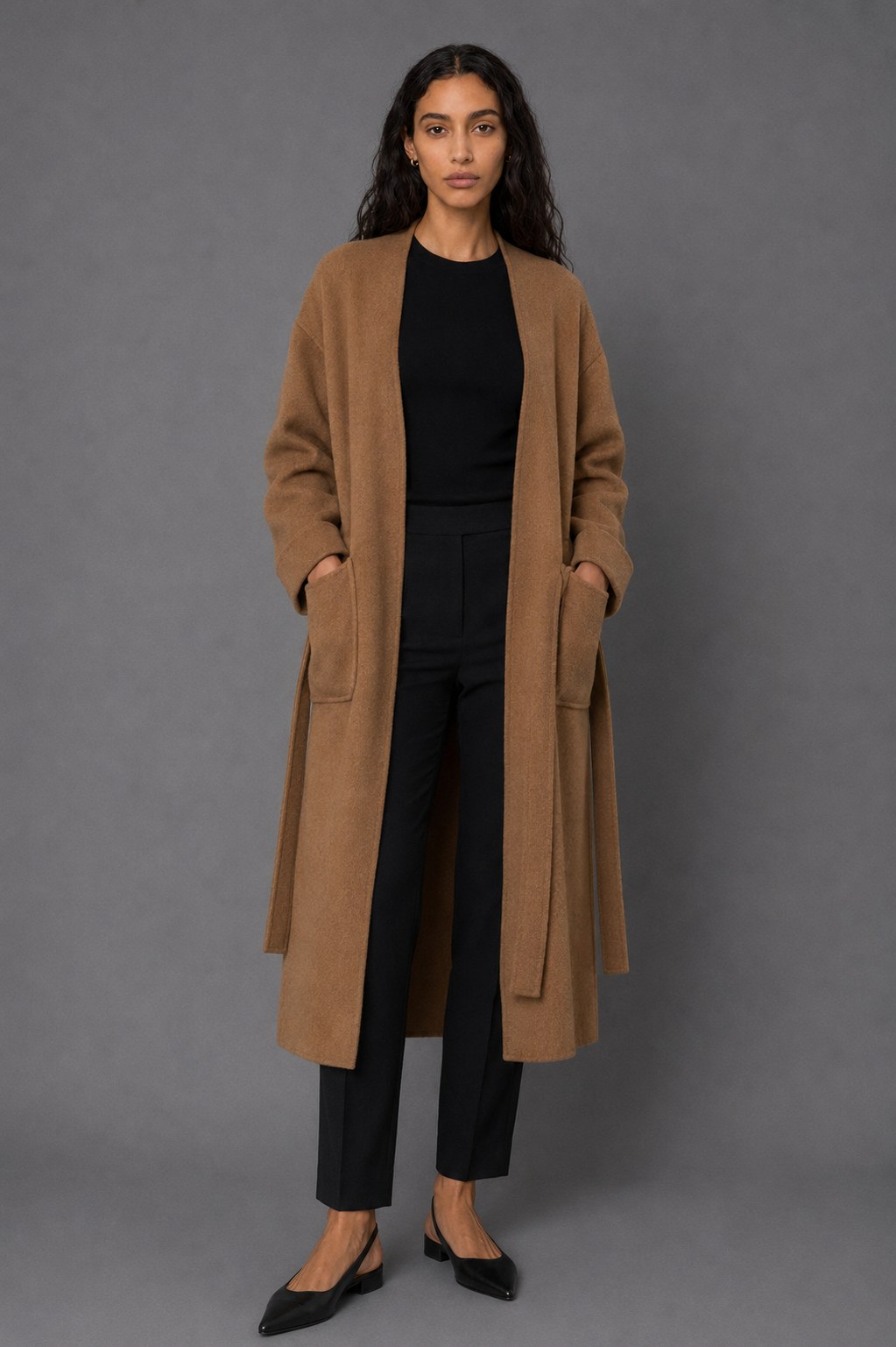
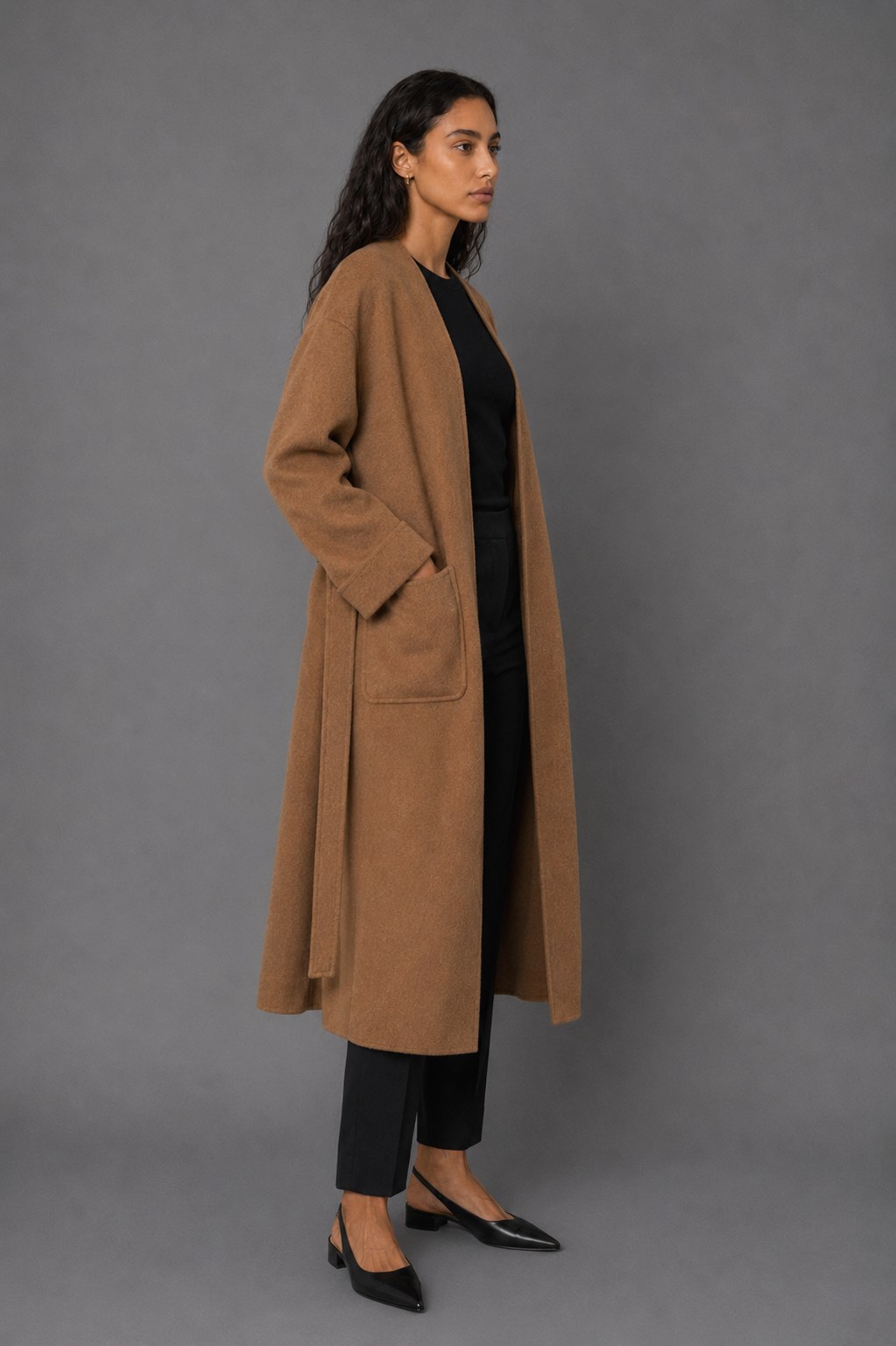
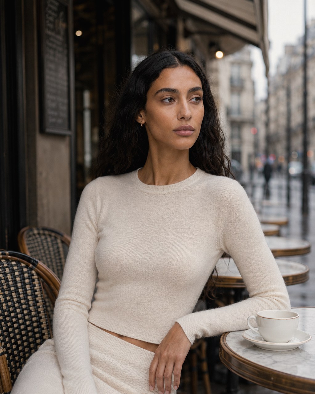
A complete campaign identity for a fashion label: one synthetic talent carried consistently across every frame, four garments, and a full expansion into e-commerce, editorial and social formats. Built as proof that one visual system can carry an entire release without a conventional shoot.
01Synthetic talent
04Garments
15Finished assets
05Delivery ratios
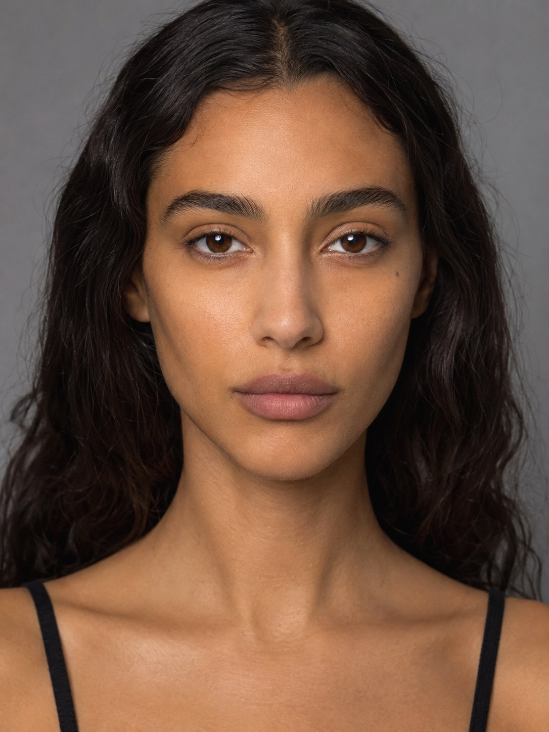
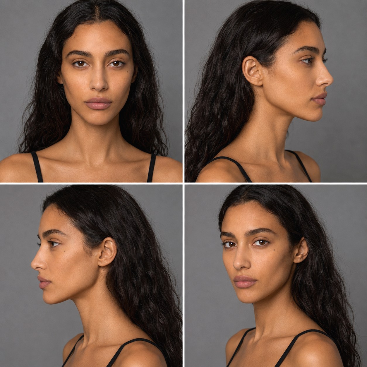
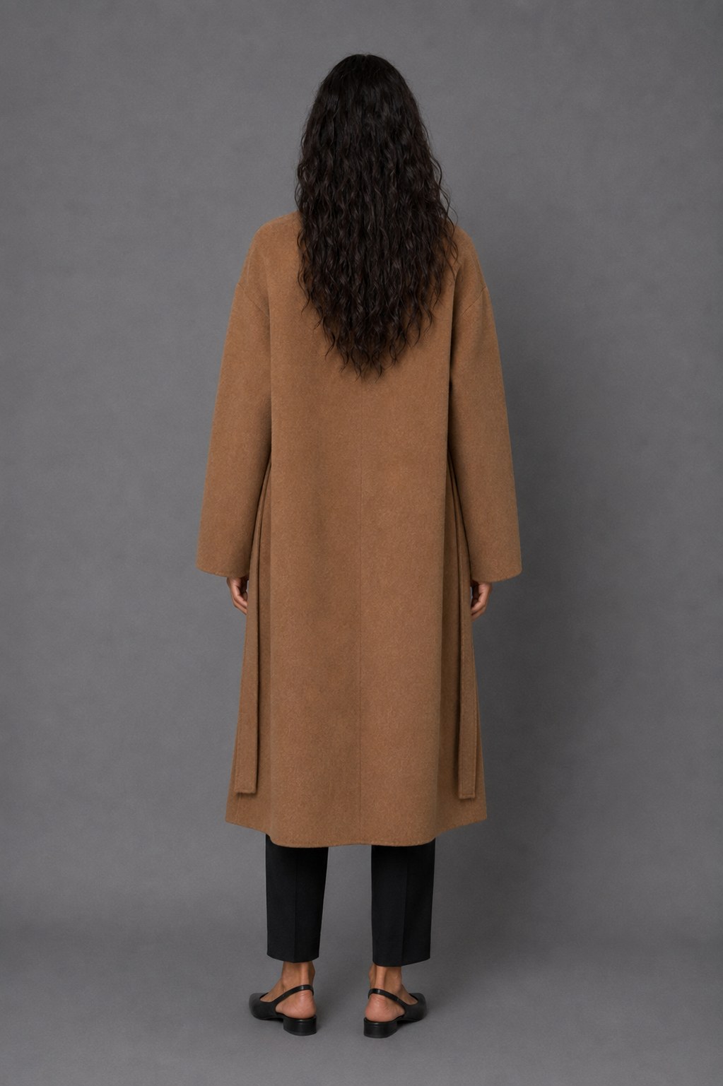
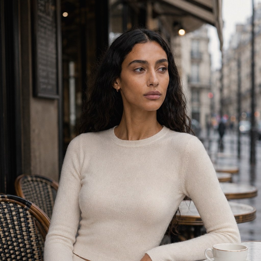
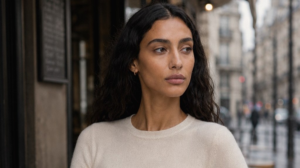
Consistency check — four angles
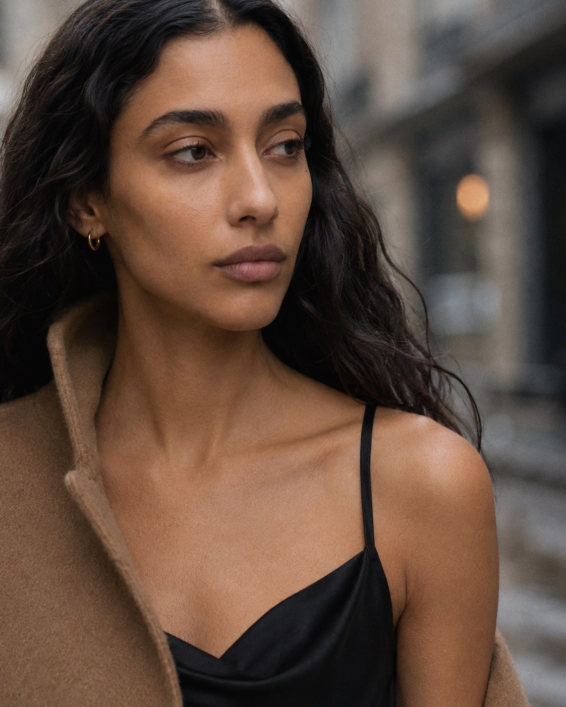
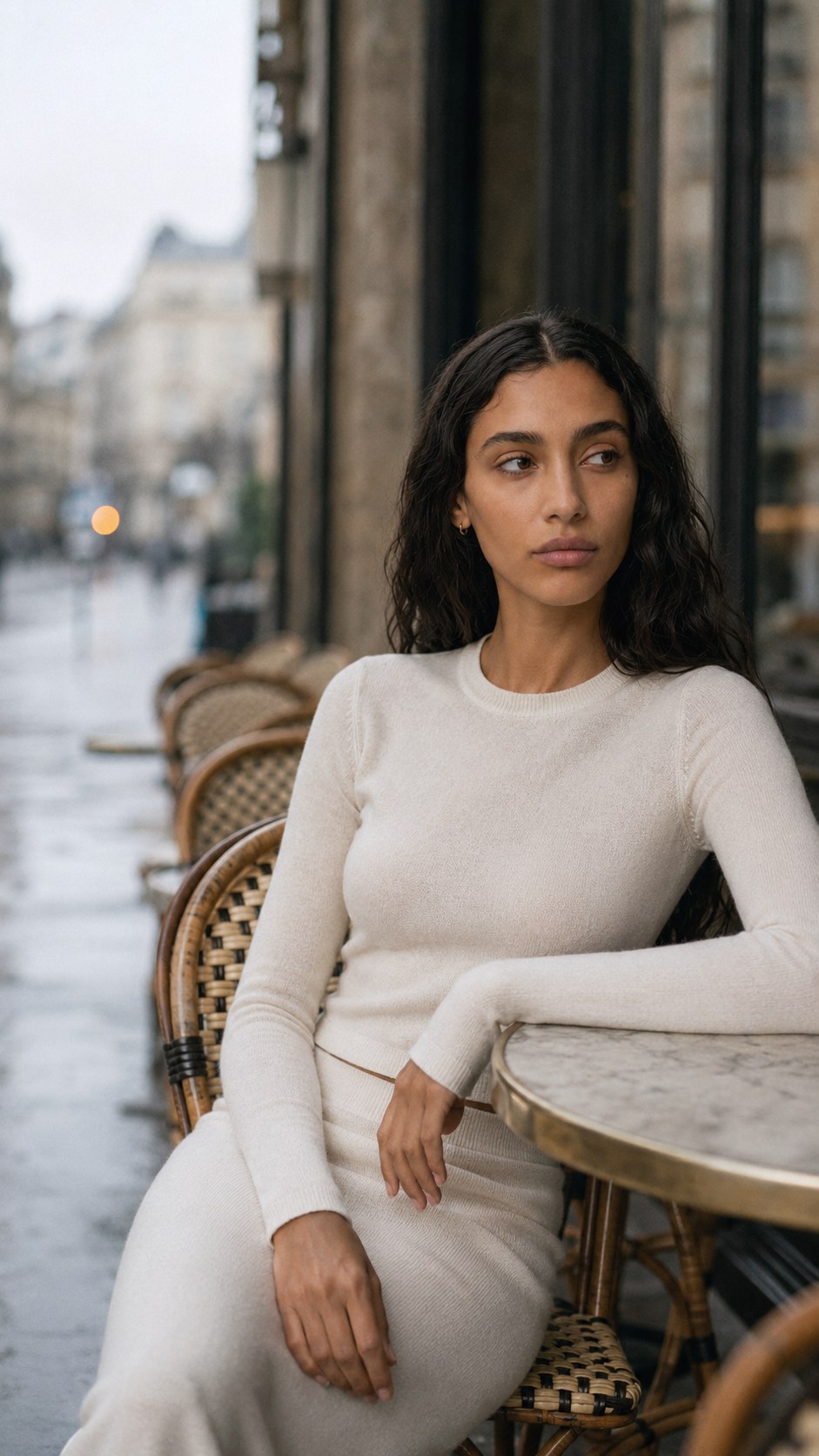
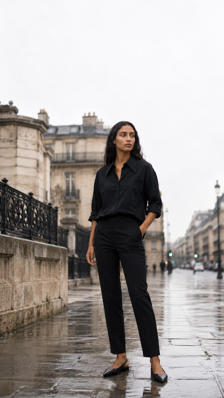
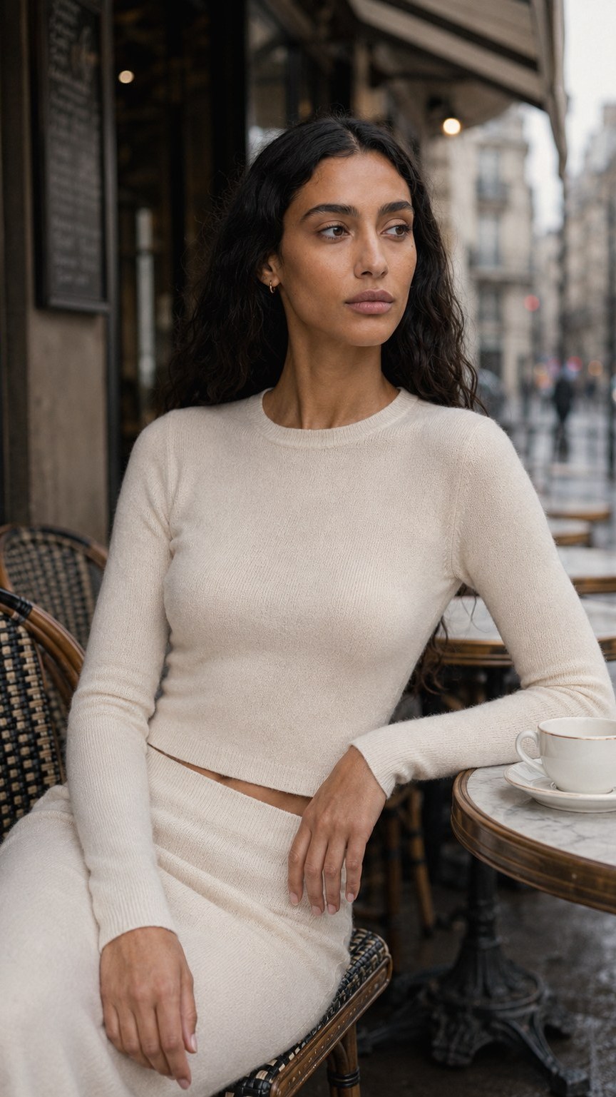
The same face, every frame.Identity holds across angle, lighting and lens before a single campaign image is made. Everything below is built on this lock — which is why the model in the studio frames and the model on the street are recognisably one person.
Campaign
Two environments, one grade and one lighting language
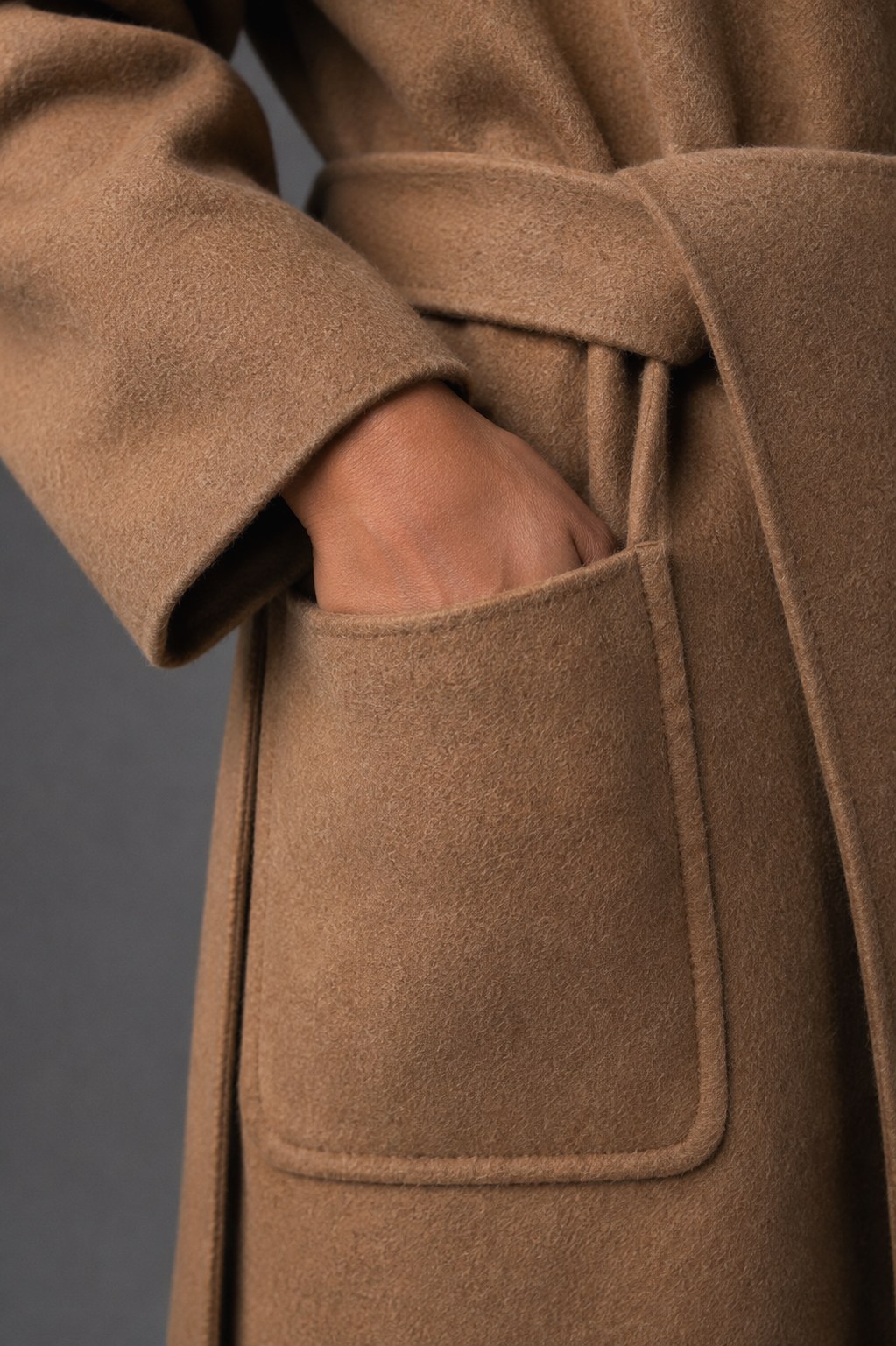
Material detail — wool, seam, pocket construction
E-commerce
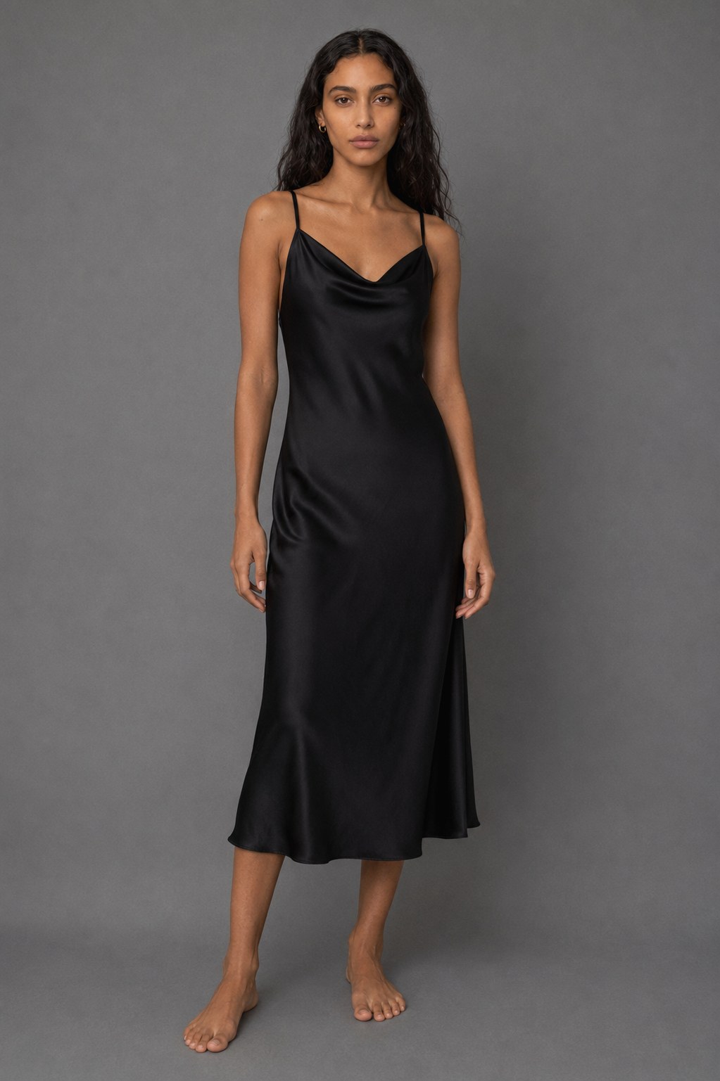
Four garments built around one seamless setup: consistent lighting, camera height and grade across the collection. The result is a catalogue system that feels produced in one session rather than assembled image by image.
Product page — one garment
Front, three-quarter, back — the full PDP set for a single piece
Social — 9:16
Composed for vertical.These frames were built for 9:16 rather than adapted into it — the subject sits where the platform's UI isn't, and the negative space is deliberate.
Case 02
Calm Companion —
Product Fidelity
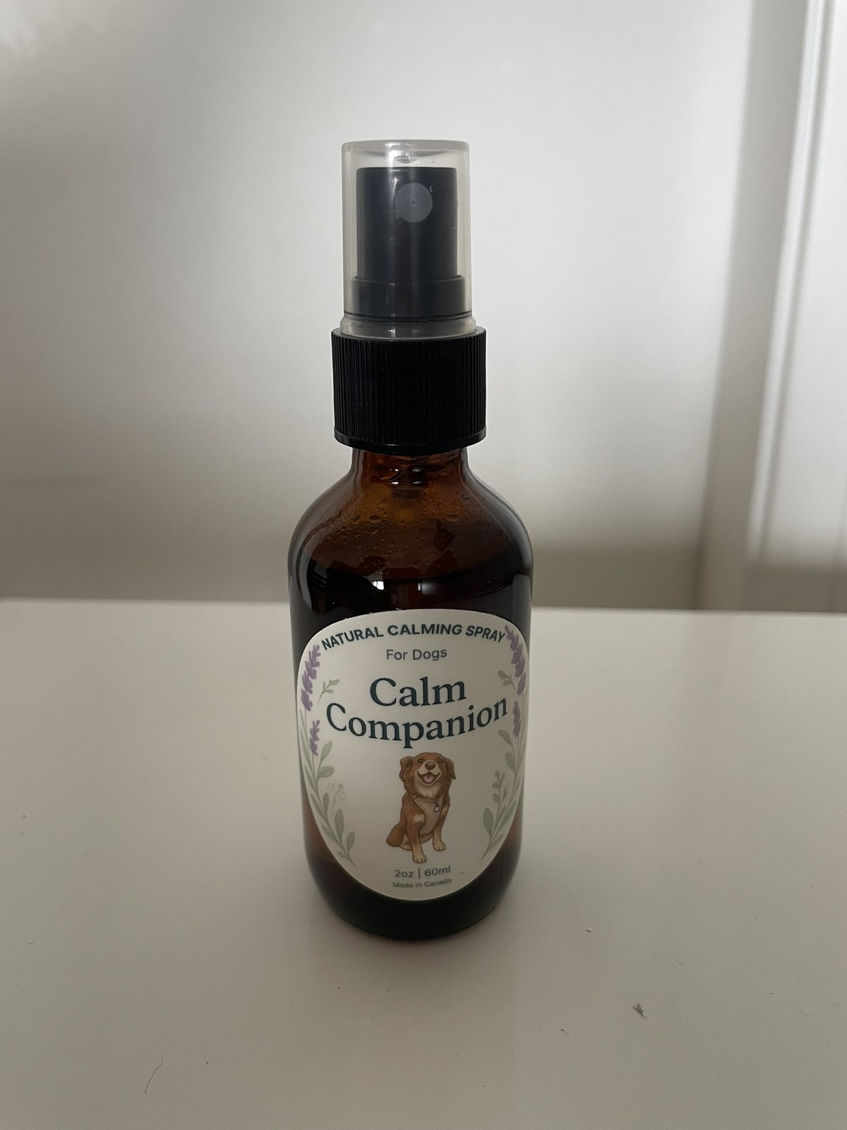
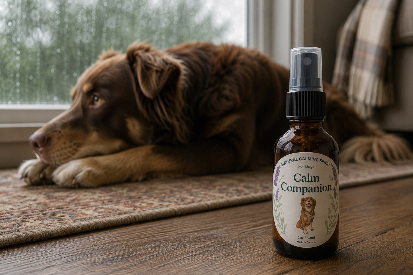
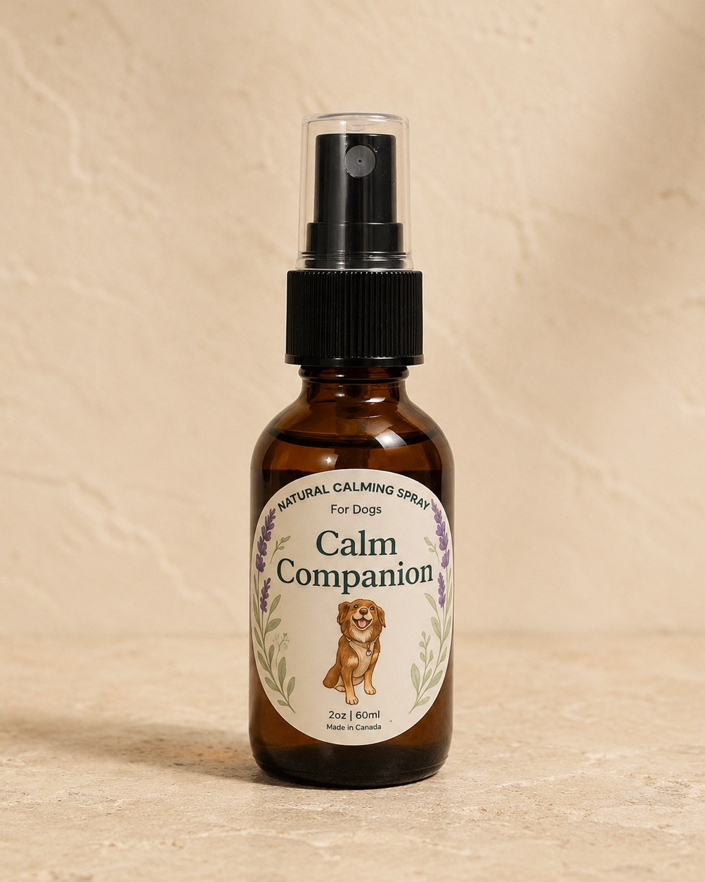
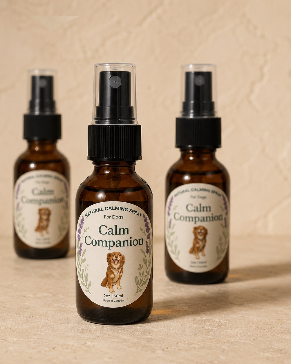
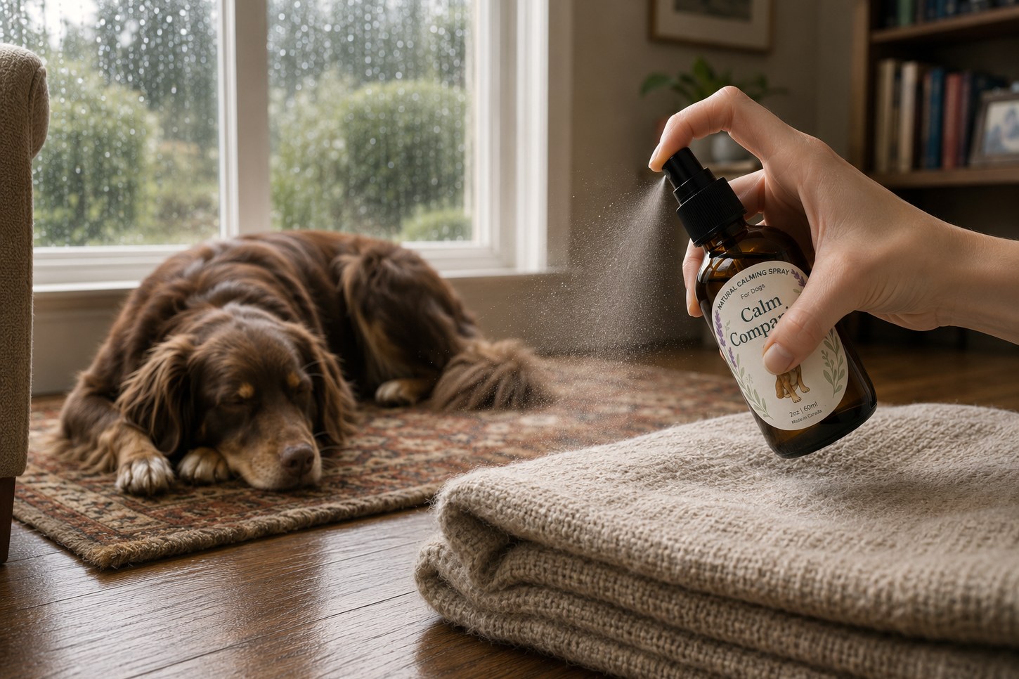
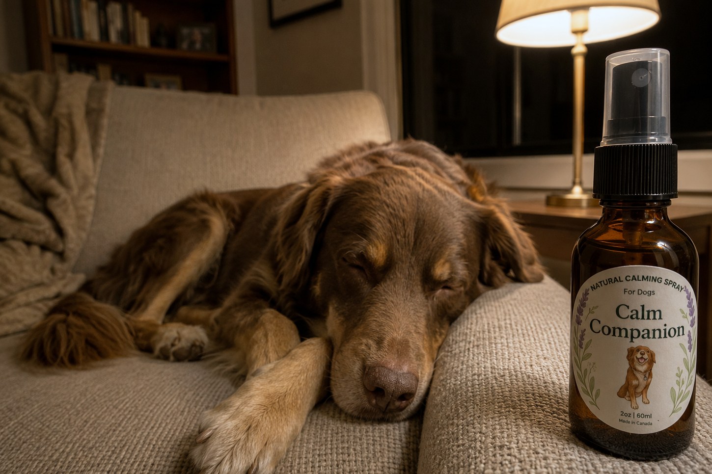
A real product, taken from a single handheld photograph into a complete set of commercial imagery. The same bottle carries across studio, macro, daylight and lamplight while the environment, composition and mood change around it. Generation builds the frame; compositing, retouching and grading keep the product consistent, recognisable and ready for use.
01Source photograph
05Finished assets
04Environments
00Studio days
iPhone, handheld, window light — unretouched
Real product reference
Calm Companion was a pet-wellness product I previously created. Although the original store is no longer active, I still had the physical bottle available to photograph and test against.
This handheld image became the primary product reference for everything that follows.
From reference to finished frame
Product consistency
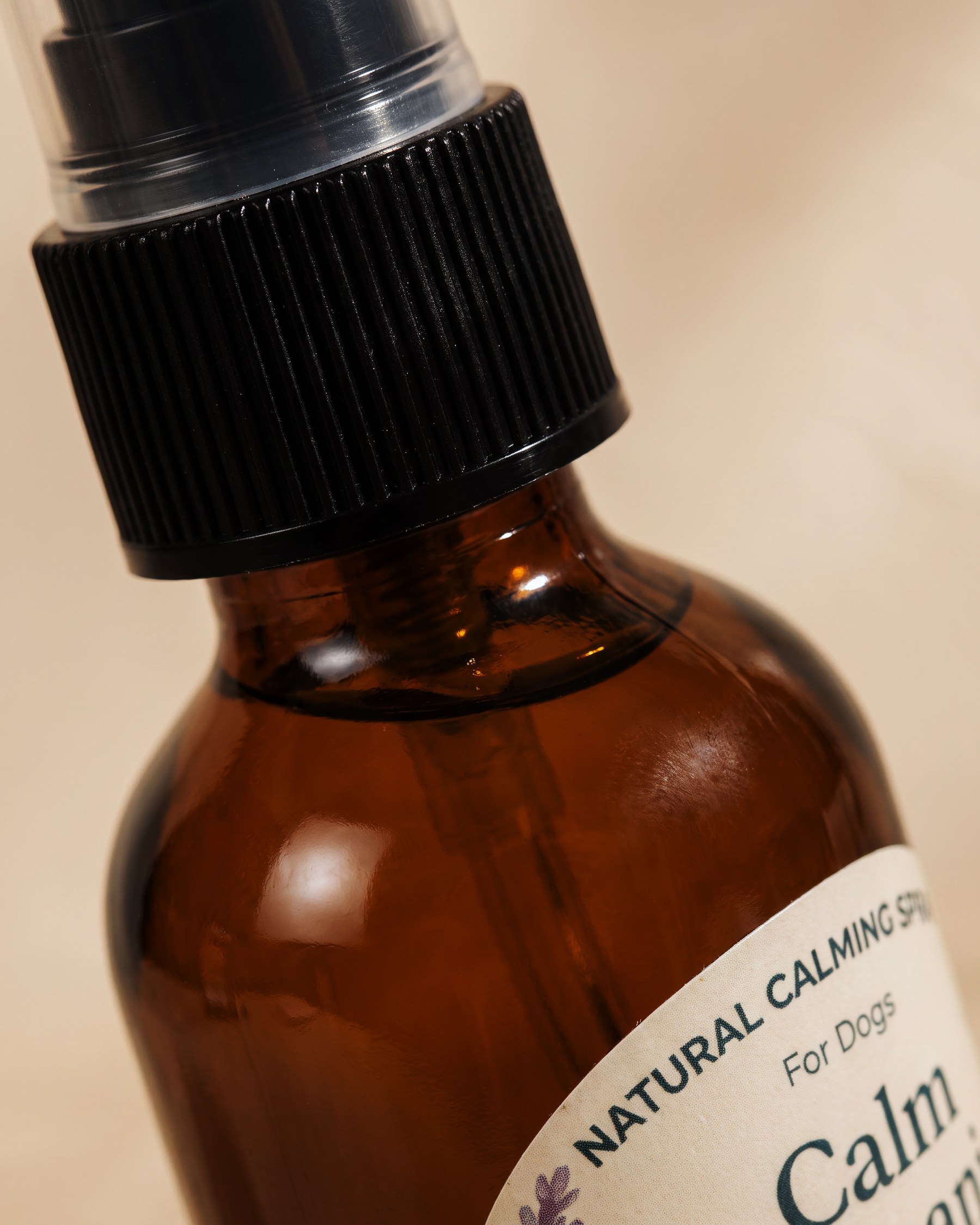
Label artwork, typography and material response carry across new lighting and compositions, with amber glass, satin vinyl and moulded plastic behaving consistently from full packshot to macro detail. Errors introduced during generation are corrected against the approved reference before delivery.
Packshot · multiple units · macro detail
Post-production
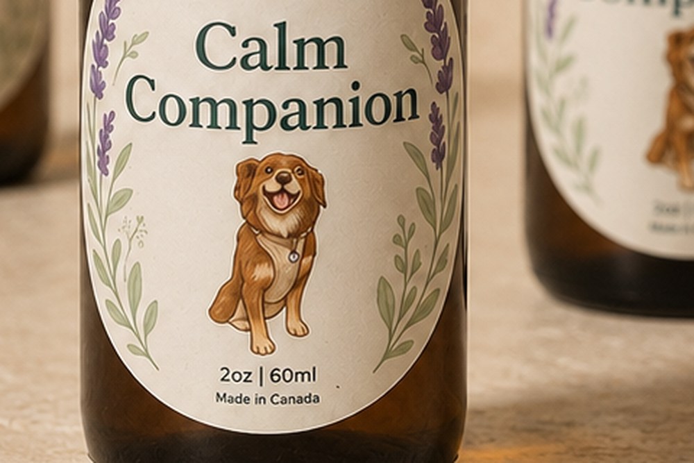
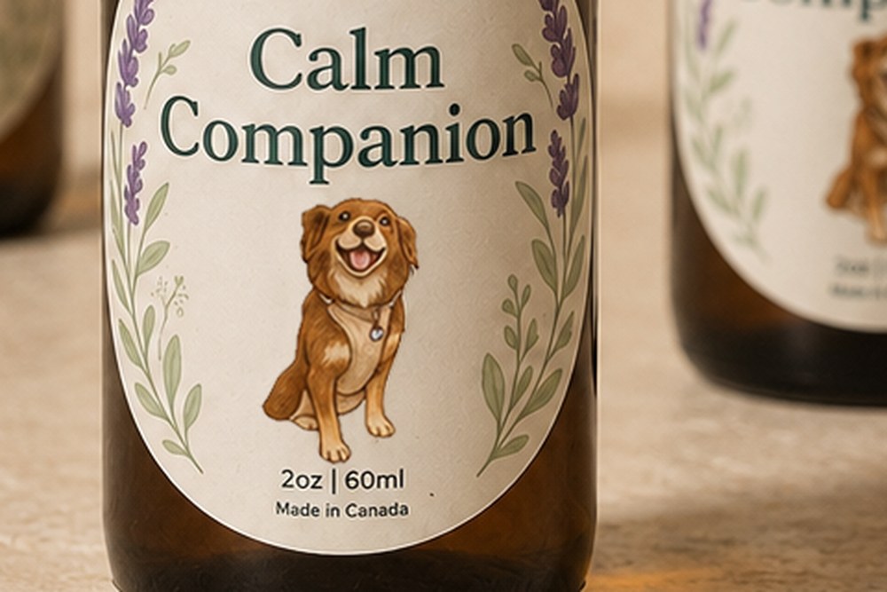
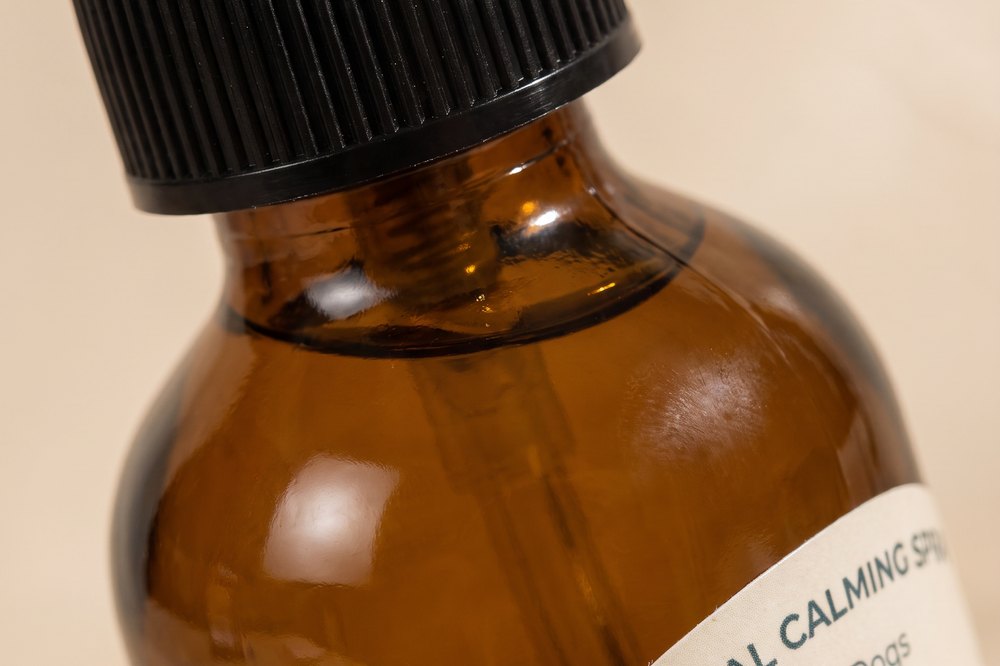
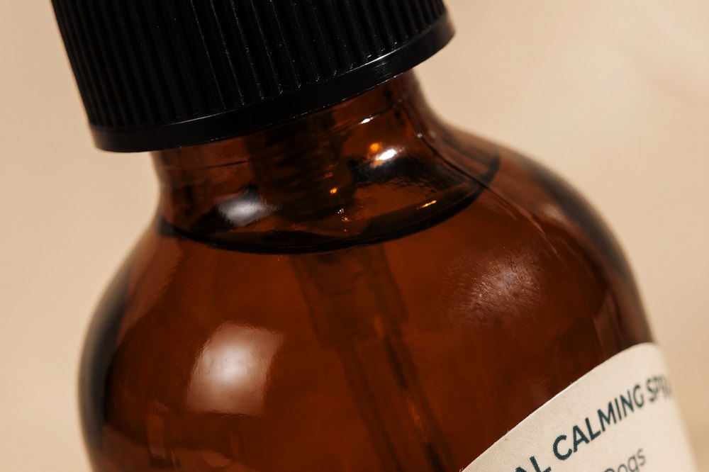
Two examples from the set. The label mascot initially returned incorrectly and was replaced using the approved artwork. Density, colour and warmth were then balanced frame by frame so that images created under daylight and lamplight still read as one production.
After — density and warmth
In use
Lifestyle — product in use, as directed